
Live Large with Less
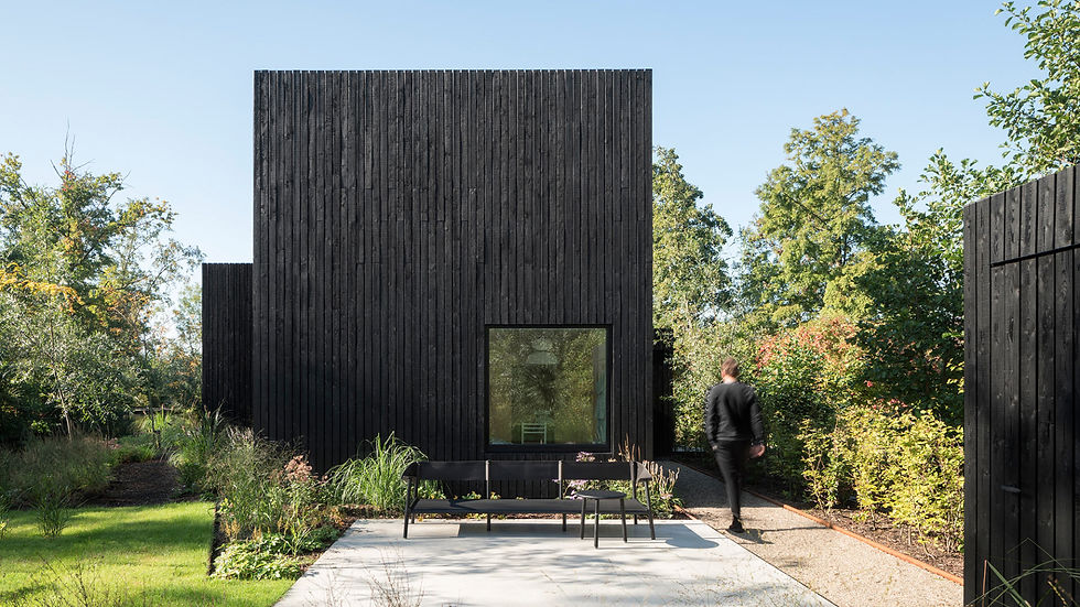
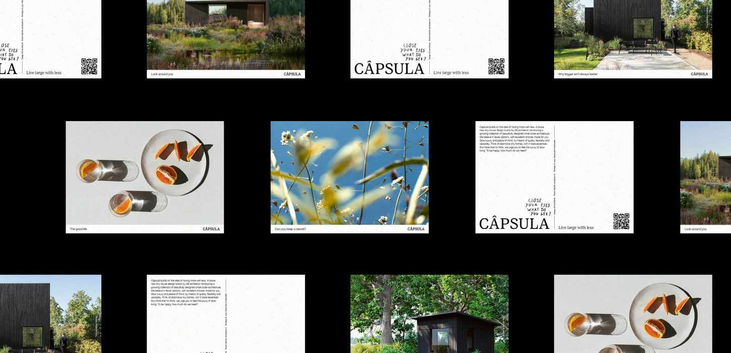
Art direction and branding for Câpsula. This new tiny houses brand builds on the promise of advanced design where less is more. Distinctive tiny architecture, rich in bare essentials. Beautifully designed dwellings with a small footprint that promote slow luxury and peace of mind. The art direction is a celebration of the good life – a life that revolves around the essentials. Picture wild, colorful flowers, warm summer evenings, late-night dinners outside, and the joy of sharing homegrown food. This feeling we encapsulated in the visual identity and imagery of Câpsula. The color palette draws inspiration from Dutch wildflowers. These colors not only reflect the beauty of nature but also infuse a sense of calm into the brand, reinforcing the idea of slow luxury and peace of mind. We've added hand-written text elements to the visual identity. These handwritten elements serve as a touch of personalization, attention, and detail, creating a bridge between the digital and offline worlds. The Dutch tiny house label is initiated by i29 architects, an award-winning architecture and interior design studio.
WHAT WE DID
Art direction, Branding, Strategy, Naming, Content creation, Campaign, Visual identity, Web design
CREDITS
Client: CÂPSULA
Initiative: i29 architects & Pieternel Kroes
Strategy & Copy: Alexandra Onderwater
Web development: Human Content Media Producties
Renderings: Plotvis
The Capsula collection is growing.
If you’re curious, you can explore it here.


